BUS5VA Visual Analytics Report 3 Sample
Assignment Details
Instruction
In this assessment, you will use SAS Viya Visual Analytics to generate an interactive report with visualisations to address tasks related to a real-world business scenario. The dataset is available on SAS Viya and can be directly imported for visualisations.
Dataset
The dataset used in this assessment is INSIGHT TOY DEMO, which can be found in the available datasets of SAS Viya (if there are two dataset with the same name, you can choose either of them).
Task 1: Create data items.
1.1 Calculate the Gross Margin of products, which is “Product Sales” – “Product Cost of Sales”, and then create a new data item for the Average Gross Margin.
1.2 Create the Product Hierarchy including Brand, Line, Make, Style (in that sequence).
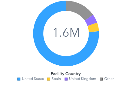
1.3 Create the Facility Geo-hierarchy including Continent, Country, Region, City (in that sequence).
For each hierarchical data item generated in the sub-tasks 1.2 and 1.3, create a drillable bar chart (e.g. choose/click continent for show data related to countries in the selected continent) to show average gross margin at each level and highlight the category with the highest average gross margin.
Task 2: Create visualisations to summarise the gross margin.
2.1 Create a crosstab to summarise the Product Sales and Gross Margin based on Countries and Continents.
2.2 Create a visualisation to show which Country generates the highest and lowest average Gross Margin.
2.3 Compare the Product Sales over time across all Continents [Hint: use transaction time].
2.4 Create a visualisation that help users understand trends related to total Gross Margin across product brands and continents.
Task 3: Create an interactive report page to explore product sales and customer satisfaction. All visualisations in this task must be in the same page.
3.1 Create a drillable geo-map to compare the Product Sales from facilities across Continents, Countries,Regions, and Cities.
3.2 Create and incorporate the Average Customer Satisfaction towards products from each facility into the above geo-map.
3.3 Create a visualisation (on the same page) for the Product Sales over time and their 4-month forecasts which can be adapted / filtered as we drill down the above geo-map.
Task 4: Build an interactive report page to help the global production manager to identify the correlations between facility attributes and customer satisfaction. All visualisations in this task must be in the same page.
4.1 Create a button bar to filter transactions by facilities from each Continent and create a bar chart to compare the Average Customer Satisfaction towards products from each Country.
4.2 Create visualisations to show the correlations between Customer Satisfaction and Customer Distance,the distribution of Customer Distance; and the Average Customer Distance over time.
4.3 Interactively adapt / filter the three visualisations in the sub-task 4.2 by selecting each Country in the bar chart created in the sub-task 4.1.
4.4 Use analytics features in SAS Viya to help you identify key factors that impact customer satisfaction. Then, visualise the effects of these key factors in this report page (one or two key factors are sufficient).
Task 5
5.1 Design an ‘overview’ page for your SAS Report to provide a description for the visualisations presented for each of the tasks above (from Task 2 to Task 4). The description should include ‘what’ you are trying to show. (Assuming that this overview page is part of the visualisation report that you would be presenting to the stakeholders.)
5.2 Prepare a Word or PDF document (max 2000 words) containing the explanations and demonstrations (e.g., taking snapshots from your SAS Viya) for all tasks including all calculations, visualisations, and interactive features. The explanations should include ‘how’ and ‘why’ you have chosen a visualisation (ordesign a report page in a certain way) to address a specific task. You should support your justificationbased on various visualisation principles and guidelines for effective visualisation.
Submission Instructions
Each report page in the SAS report needs to be appropriately named based on the given tasks. Please include the snapshot of each page in your explanation document.The first page of the SAS report should be the overview with a brief description for each task. Use the print option to generate the PDF file for the report (with all the pages included) and submit the PDF report via the submission link on LMS.
Solution
Introduction
As the tasks presented in this assessment also entail leveraging SAS Viya Visual Analytics to analyse and visualise data pertaining to a real-world business scenario. So, each task is designed to address specific aspects of the business, and ranging from product profitability to customer satisfaction. Thus, through calculated measures, hierarchies, and interactive visualisations, the aim is to provide comprehensive insights that can inform strategic decision-making. Therefore, the integration of these techniques also showcases the proficiency in utilising SAS Viya as a powerful tool for data analysis and reporting.
Task 1: Creating data items
1.1. Calculating the Gross Margin of products
As in Task 1.1, the analyst also computed the Gross Margin for products by subtracting the "Product Cost of Sale" from the "Product Sale" metric. And for the product category "Toy," the Product Cost of Sale was also determined to be $15,535,024, while the Product Sale amounted to $19,246,701 (in millions). Thus, this yielded a Gross Margin of $3,711,677 (in millions) for Toy products.
Similarly, for the product category "Novelty," the Product Cost of Sale was also calculated as $11,097,616, and the corresponding Product Sale amounted to $12,421,675 (in millions). Subsequently, the Gross Margin for Novelty products was also determined to be $1,324,059 (in millions).
So, following the Gross Margin calculations for individual products, the analyst also proceeded to create an additional data item for the Average Gross Margin. Thus, this metric also provides a comprehensive view of the overall profitability across all product categories, and enables a more holistic assessment of the business's financial performance. Therefore, this step ensures that the analysis encompasses a broader perspective beyond individual product margins.
.png)
1.2. Product Hierarchy
Task 1.2 involved creating a hierarchical structure for the Product Hierarchy, specifically incorporating Brand, Line, Make, and Style in that sequence. As this hierarchy enables a structured categorization of products, thus facilitating a more organised and detailed analysis. Thus, by establishing these levels, stakeholders can also gain insights into the performance of different product attributes, and allowing for a more granular understanding of profitability trends.
1.3. Facility Geo-Hierarchy
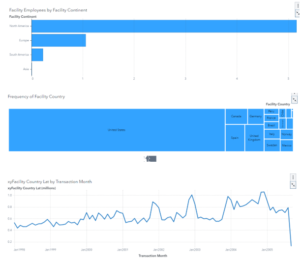
Task 1.3, as the analyst constructed a Facility Geo-hierarchy comprising Continent, Country, Region, and City. As this hierarchical structure is invaluable for analysing sales and profitability across different geographic dimensions. It also allows for a multi-level examination of performance, and from a macro perspective (continent) down to a localised view (city). This also enables stakeholders to identify regional trends and disparities, aiding in targeted decision-making.
Task 1 also lays the groundwork for a comprehensive analysis of product profitability. Thus, through the calculation of Gross Margin and the establishment of hierarchical structures for both product attributes and geographical dimensions, the analyst also provides a structured and detailed framework for subsequent tasks. Significantly this foundation is essential for generating meaningful insights into the business's financial performance.
Task 2: Creating visualisations to summarise the gross margin
2.1. Crosstab
Task 2 As focuses on creating visualisations to summaries Gross Margin based on various dimensions such as countries, continents and also over time. These visualisations are instrumental in providing a clear and even concise overview of the business's financial performance.
In Task 2.1, However the analyst generated a crosstab to summarise Product Sales and also Gross Margin based on Countries and even Continents. So, this crosstab serves as a powerful tool to compare and specifically contrast the performance of different regions. However, By displaying the data in a tabular format which stakeholders can easily identify trends, disparities and also potential areas for improvement. Thus, the inclusion of both Product Sales and also Gross Margin in the crosstab offers a comprehensive view of the financial metrics, allowing for a thorough assessment of the business's revenue generation and its profitability across different geographical areas for university assignment help
2.2. Visualisation for showing gross margin of countries
Task 2.2 As it involves creating a visualisation to highlight the country that generates the highest and also the lowest average Gross Margin. So, this visualisation provides a quick and also intuitive way to identify the top-performing and also underperforming countries in terms of profitability. However, by visually representing this information while stakeholders can swiftly focus their attention on specific regions that may require further analysis or strategic adjustments. So, this visualisation is crucial for allocating resources effectively and even optimising operations for maximum profitability.
2.3. Comparing Product Sales
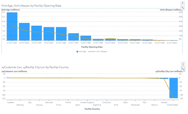
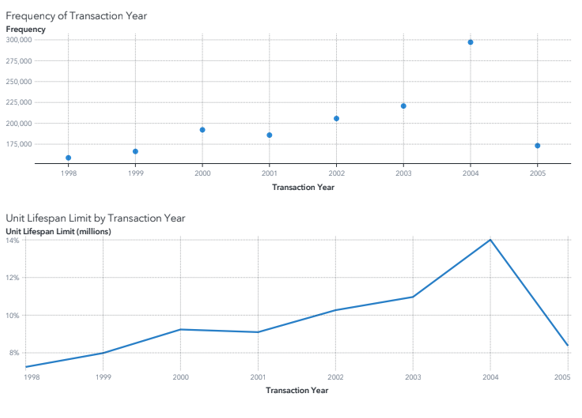
For Task 2.3 While the analyst compares Product Sales over time across all Continents using transaction time. Thus, this line chart or time series analysis offers a dynamic view of sales trends that enables stakeholders to discern patterns, seasonality and potential growth opportunities. By examining sales performance over a period, decision-makers can make informed decisions regarding inventory management, marketing strategies and its resource allocation. So, this visualisation serves as a valuable tool for forecasting and even planning future sales initiatives.
2.4. Visualisation Regarding Gross Margin Trend
In Task 2.4 Practically the analyst creates a visualisation to elucidate trends related to total Gross Margin across product brands and even continents. However, this likely involves a multi-dimensional chart or graph that provides insights into how different product brands contribute to overall profitability across various regions. So, By visualising this information stakeholders gain a comprehensive understanding of product categories and also regions are the most lucrative. Significantly this knowledge can guide marketing efforts, inventory management and even strategic partnerships to further enhance profitability.
Task 2 Thus this demonstrates the adept use of SAS Viya Visual Analytics to generate insightful visualisations that effectively summarise Gross Margin. However, these visualisations offer a comprehensive view of the business's financial performance while allowing stakeholders to make informed decisions and also implement strategic initiatives to maximise profitability.
.png)
.png)
Task 3: Exploring Product Sales and also Customer Satisfaction
Task 3 Specifically focuses on creating an interactive report page in SAS Viya Visual Analytics to explore product sales and also customer satisfaction. While this task involves the integration of various visualisations on a single page to provide a comprehensive view of these key performance indicators.
3.1. Drillable Geo-map
In Task 3.1, However the analyst begins by crafting a drillable geo-map to compare Product Sales across different levels of geographical hierarchy which includes Continents, Countries, Regions and even Cities. More ever this interactive map serves as a powerful tool to visualise sales performance in different regions. However, by allowing users to drill down to more specific levels such as cities that the map provides a dynamic and also insightful view of sales trends across various geographic dimensions. Additionally, this feature enables stakeholders to pinpoint areas of high or even low performance while facilitating targeted interventions for optimization.
3.2. Incorporation of the Average Customer Satisfaction on the geo map
Task 3.2 Thus involves incorporating Average Customer Satisfaction ratings into the existing geo-map. This integration adds an additional layer of information, allowing stakeholders to correlate sales performance with customer satisfaction levels. By visualising this data in conjunction with sales figures while decision-makers gain a comprehensive understanding of the relationship between customer sentiment and also revenue generation across different geographic areas. However, this insight is crucial for identifying areas of strength and even areas that may require improvement in customer experience.
3.3. Visualisation of Product Sales Over Time with Forecasts
In Task 3.3, Thus the analyst creates a visualisation for Product Sales over time and their 4-month forecasts which can be dynamically adapted or filtered as users drill down on the geo-map. So, this dynamic time series analysis offers a view of sales trends and forecasts while allowing stakeholders to make informed decisions based on projected performance. Thus, by incorporating interactivity that adapts to the selected geographic region while users can gain localised insights into future sales trajectories. Therefore, this empowers decision-makers to plan resources that marketing strategies and also inventory management with greater precision.
However, the integration of these visualisations on a single page in Task 3 provides a comprehensive view of product sales and even customer satisfaction. However, this consolidated approach allows stakeholders to quickly and also efficiently gather insights into the performance of different regions and make informed decisions accordingly. However, the interactivity and its adaptability of the visualisations enhance user engagement and also facilitate a more dynamic exploration of the data.
Task 3 While demonstrates a proficient use of SAS Viya Visual Analytics to create an interactive report page that effectively explores product sales and also customer satisfaction. Thus, the incorporation of drillable geo-maps, customer satisfaction data and also dynamic time series visualizations provides a robust platform for stakeholders to gain valuable insights into the business's performance across various geographic dimensions.
Task 4: Correlations between facility attributes and customer satisfaction
Task 4 is also focused on building an interactive report page to assist the global production manager in identifying correlations between facility attributes and customer satisfaction. Practically this task involves the integration of various visualisations on a single page to provide a comprehensive view of these key performance indicators.
4.1. Button Bar Creation
As in Task 4.1, the analyst also starts by creating a button bar to filter transactions by facilities from each Continent. As this interactive element also allows the global production manager to select specific continents and view data related to facilities within those regions. So, this filtering capability is invaluable for isolating and analysing data from specific geographic areas, thus enabling the manager to focus on regions of interest.
Specifically in conjunction with the button bar, as the analyst generates a bar chart to compare the Average Customer Satisfaction towards products from each Country. Specifically, this visualisation provides a clear and concise overview of customer satisfaction levels across different countries. Thus, by presenting this data in a visual format, the manager can also easily identify countries with the highest and lowest levels of customer satisfaction. Thus, this information is crucial for directing resources and efforts towards areas that may also require improvement in customer experience.
4.2. Visualisations to Show the Correlations Between Customer Satisfaction and Customer Distance
Task 4.2 also involves creating visualisations to demonstrate the correlations between Customer Satisfaction and Customer Distance. Significantly this likely involves scatter plots or correlation matrices to visually represent the relationship between these two variables. So, in addition, the distribution of Customer Distance and the Average Customer Distance over time are visualised. Therefore, these visualisations provide insights into how customer proximity to facilities may also impact satisfaction levels. Thus, they also help the production manager identify patterns and potential areas for improvement as in customer service and distribution strategies.
4.3. Filtration
In Task 4.3, the analyst also introduces interactivity by allowing users to adapt and filter the three visualisations created in Task 4.2 by selecting each Country in the bar chart from Task 4.1. Significantly this dynamic feature enables the production manager to also focus on specific countries of interest and observe how customer satisfaction and also distance metrics evolve over time. Thus, this level of interactivity enhances the manager's ability to perform in-depth analyses and even make data-driven decisions.
4.4. Key Factors That Impact Customer Satisfaction
Task 4.4 also involves the use of analytics features in SAS Viya to even identify key factors that impact customer satisfaction. Significantly the analyst then visualises the effects of these key factors on the interactive report page. AS this step is crucial for providing actionable insights to the production manager. So, for example, if the factors such as shipping times or even product availability significantly impact customer satisfaction, thus visualising these effects allows the manager to prioritise strategies for improvement.
Therefore, by integrating these visualisations and even interactive elements on a single page, Task 4 also provides a powerful platform for the global production manager to gain valuable insights into the correlations between facility attributes and also customer satisfaction. As the combination of interactive filters, visual representations of correlations, and even dynamic adaptations based on user selections empowers the manager to perform in-depth analyses and also make informed decisions.
As Task 4 showcases a proficient use of SAS Viya Visual Analytics to build an interactive report page that also facilitates a detailed exploration of facility attributes and also their impact on customer satisfaction. Thus, the incorporation of interactivity, visualisations, and analytics features also provides the global production manager with a robust toolset to identify correlations, analyse trends, and even implement strategies for improved customer satisfaction.
Task 5: Overview
The analyst is specifically tasked with designing an 'overview' page particularly within the SAS Report. This page particularly serves as a crucial introduction to the visualisations presented for Tasks 2 to 4. It primarily encapsulates concise descriptions of what each visualisation aims to particularly convey. By providing stakeholders specifically with a clear understanding of the objectives behind each visualisation, the overview page predominantly enhances their ability to extract meaningful insights primarily from the subsequent visual representations. This practically ensures that stakeholders approach the report with a well-informed perspective, therefore maximising the impact and also effectiveness of the visualisations specifically in informing decision-making processes.
Conclusion
Significantly in culmination, the completion of these tasks also demonstrates a high level of proficiency in utilising SAS Viya Visual Analytics for data analysis and even visualisation. Thus, the calculated measures, hierarchies, and interactive features have been skilfully employed to provide valuable insights into product profitability, geographical performance, customer satisfaction, and also facility attributes. Thus, by presenting the information in a clear and interactive format, stakeholders can even make informed decisions to optimise operations and also enhance customer experience. Preferably this comprehensive approach to data analysis showcases not only technical expertise but also an understanding on how to leverage visualisation tools for effective business intelligence. Therefore, the completion of these tasks also reflects a strong foundation in utilising SAS Viya to drive data-driven decision-making in a real-world context.
Would you like to schedule a callback?
Send us a message and we will get back to you


Highlights
Earn While You Learn With Us
Confidentiality Agreement
Money Back Guarantee
Live Expert Sessions
550+ Ph.D Experts
21 Step Quality Check
100% Quality
24*7 Live Help
On Time Delivery
Plagiarism-Free

 81 Isla Avenue Glenroy, Mel, VIC, 3046 AU